How Many Calls To Action Should You Use?
Jason Benedict
on
June 23, 2024

A guide on how to get higher conversions from your paid traffic.
Wondering what might be going wrong with your digital marketing strategy? Have you considered that the campaign itself might be fine, but there could be an issue with your next step?
The role of a webpage, on which you direct your paid traffic, is like a main character in your digital marketing process. The CTAs in a webpage are equally important. If your webpage doesn't have those, then people might not do what you want them to do. CTAs help you get more sales or contacts by clearly telling visitors how to take the next step.
But first know - on which web page the traffic should be directed
Generally, marketers direct their hard-won traffic to their website’s homepage. However, there is a better way. Directing your traffic to a dedicated landing page can significantly improve your conversion rates.
No, landing pages are not the same as a homepage.
The key difference between the two is that a landing page focuses solely on promoting a specific product or service, while a homepage acts as a hub, providing overall information about all your products or services.
Think about this:
You are in the office, your sales are going down, and you want a better solution to grow your customer base once again. So, you call up a digital marketer and ask him to provide reports and solutions.
Instead of giving you detailed statistics and specific strategies, he just gives you a general idea of how digital marketing works and its importance in growing the customer base. You have no idea what to do next.
In this scenario, you are the potential customer, and the marketer represents a type of ad.
As the owner of your company, you already know the benefits of digital marketing and why you should use it. But you were looking for a specific strategy on “how to do this.” Instead, the marketer just reiterated what you already knew.
Now, you are left with a continuous question ringing in your head: “What next?”
Yes, you will find another digital marketer instead of giving a chance to this one. You will find someone else who will actually solve your problems and address your specific needs.
The Game of Call to Action in a Landing Page
Explaining What is a Call to action in a broader sense
A CTA isn't merely a button labeled "click here," "book now," or "learn more." It serves to compel your prospects to take action. Broadly, the layout of your landing page should encourage a prospect to act. When your page provides the exact solution your target audience is searching for, they are most likely to take action and contact you immediately. However, if your landing page offers only generalized information without addressing specific needs, prospects might not feel compelled to act.
To understand this better, Consider this example:
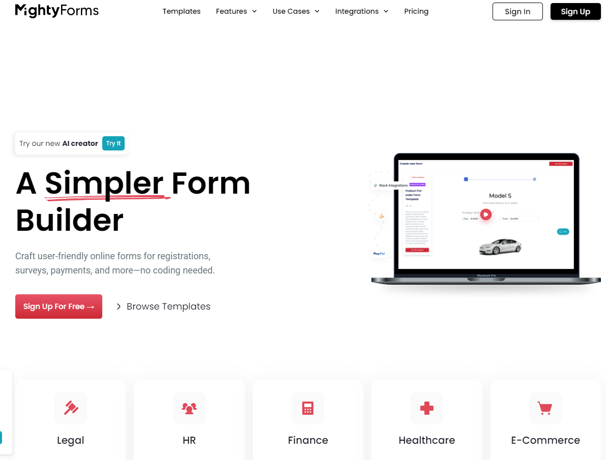
You want to create an HTML contact form and search for a guide online. You land on a page that provides a general solution on "how to make a contact form" without specifically addressing how to create it in HTML. Despite the page having many CTAs, you won't take action because it doesn't address your specific need.

The above website gives a general idea of how to create forms easily.
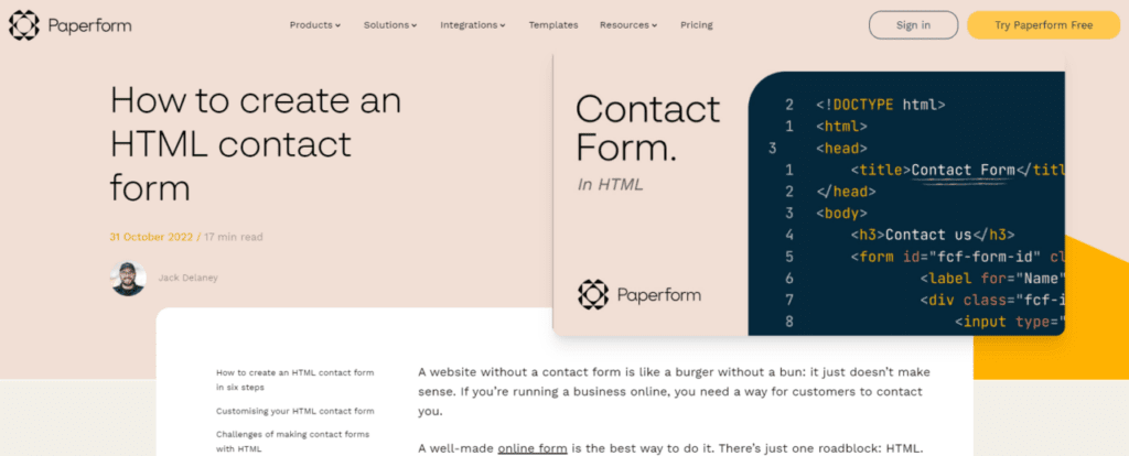
Now, you click on the second search result and find a page that specifically addresses your problem, providing the exact solution you need. This page is more effective, as people are more likely to take action and click on the call-to-action button because it delivers exactly what the prospect wants.

This website provides the exact information on how to create HTML forms
In summary, the relevance and specificity of content are vital for the effectiveness of CTAs on a landing page. Ensure your page addresses the specific needs of your prospects to create compelling calls to action.
Factors to Consider When Deciding the Number of CTAs
1. Purpose of the Landing Page:
- Single-Goal Pages: If your landing page has a single, clear objective (e.g., downloading an eBook, or signing up for a webinar), one primary CTA is often sufficient. This reduces distractions and focuses the visitor’s attention on the desired action.
- Multi-Goal Pages: For more complex pages where multiple actions might be appropriate (e.g., a product page where visitors might want to learn more, request a demo, or buy), multiple CTAs can be effective. However, they should be well-organized and visually distinct.
2. User Experience:
- Simplicity and Clarity: Your CTAs should be easy to find and understand. Overloading a page with too many CTAs can confuse visitors and lead to decision paralysis.
- Hierarchical Structure: Use primary and secondary CTAs to create a hierarchy. The primary CTA should be the main action you want users to take, while secondary CTAs can offer alternative options without detracting from the primary goal.
3. Audience and Context:
- User Intent: Consider what stage of the buyer’s journey your visitors are likely in. Early-stage visitors may prefer a "Learn More" CTA, while those further along may be ready for a "Buy Now" or "Sign Up" CTA.
- Demographics and Behavior: Tailor your CTAs to your audience’s preferences and behaviors. A/B testing can help determine the most effective number and placement of CTAs.
A/B testing, also known as split testing, is a method used to compare two versions of a webpage or other user experience to determine which one performs better. By randomly showing two versions (A and B) to different segments of your audience, you can measure and analyze the impact of each version on user behavior and key metrics such as click-through rates, conversions, or engagement.
Best Practices for CTA Placement and Design
- Above the Fold: Place at least one CTA above the fold (the visible part of the page without scrolling). This ensures that it is immediately visible to visitors.
- Throughout the Page: For longer landing pages, include multiple CTAs at strategic points. This keeps the action options available as visitors scroll through the content.
- Visual Contrast: Ensure your CTAs stand out by using contrasting colors, bold fonts, and ample whitespace. They should be prominent but not overpowering.
- Compelling Copy: Use clear, concise, and action-oriented language. Phrases like "Get Started," "Claim Your Free Trial," or "Join Now" are more effective than generic terms like "Submit."
- Mobile Optimization: With a significant amount of web traffic coming from mobile devices, ensure your CTAs are easily clickable and visible on smaller screens.
Examples of Effective CTA Strategies
1. Single-Goal Landing Page:
- A landing page promoting a free eBook might feature a single, prominent CTA: "Download Your Free eBook." This CTA could appear multiple times: above the fold, mid-page, and at the end.
2. Multi-Goal Landing Page:
- A SaaS product page might include CTAs like "Start Free Trial," "Request a Demo," and "Learn More." The primary CTA ("Start Free Trial") would be the most prominent, with secondary CTAs providing additional options.
The number of CTAs on your landing page should align with the page’s goals, user experience, and audience needs. While there is no one-size-fits-all answer, a well-considered approach—emphasizing clarity, simplicity, and strategic placement—will help maximize conversions. Regular testing and analysis are essential to fine-tuning your CTAs and ensuring your landing page performs at its best.
By thoughtfully balancing the number and design of CTAs, you can create a compelling landing page that effectively guides visitors toward taking the desired actions.
About Automation Agency
Automation Agency is a renowned growth agency that assists small businesses in boosting lead generation and client conversion and fostering a solid fan base. They achieve this by harnessing the power of their proven and tested C3 Growth Framework. Founded by the dynamic couple Jason and Therese Benedict, Automation Agency offers various services.
To learn more about how they can drive your business growth, contact a Keap Marketing Automation Expert. You can reach them by calling or texting 602.900.9345 or visiting the website at https://automation.agency/.
- Category: Entrepreneurship, Marketing
- Tag: ai agent, ai appointment setter, business process automation

